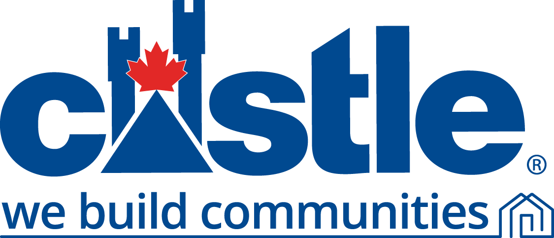
Castle Corporate Logo
- The ‘Castle’ name
- The ‘Maple Leaf on the Castle Turret’ representing that Castle is proudly Canadian
- The ‘®’ Registered Trademark
- The ‘We Build Communities’ wordmark
- The ‘house underline’ representing communities
Alternatively, the Castle Corporate signature without the Tagline can be used depending on use. It is composed of three separate elements:
- The ‘Castle’ name
- The ‘Maple Leaf on the Castle Turret’ representing that Castle is proudly Canadian
- The ‘®’ Registered Trademark
These elements are always to be used together, on all Castle Corporate communications from Head Office. The elements must not be separated or displayed alone.
The registered trademark symbol ® is required when using the logo. The placement of the ® is to be located consistently to the bottom right of the “e.”
- Castle Blue – Pantone280 (coated and uncoated stock)
- Castle Red – Pantone485 (coated and uncoated stock)
These colours must be used consistently across all internal and external communications. When applying the logo to all types of paper and materials, as well as web and broadcast media, please check with your teams and vendors to ensure that colours have accurately been reproduced.
The corporate colours must be matched Pantone colour standards. Refer to Pantone Colour Publications and resources for the accurate colour.
- Full Colour: This is the preferred choice, to be used whenever possible and always on full-colour creative, across all media
- 1-colour Printing: For one-colour printing, the complete logo must be printed in black only
- Reverse printing: In cases where the signature appears on a dark background, the entire signature may be reversed out in white only
These colours must be used consistently across all internal and external communications. When applying the logo to all types of paper and materials, as well as web and broadcast media, please check with your teams and vendors to ensure that colours have accurately been reproduced.
The corporate colours must be matched Pantone colour standards. Refer to Pantone Colour Publications and resources for the accurate colour.


Please ensure that there is a minimum of 1/4X clear space maintained around the logo, where X is the height of the symbol. Leaving more clear space than this is also acceptable. Always leave at least this distance between the logo and the edge of the page, sign, envelope or any other medium where it appears. The registered trademark symbol ® is not included in the measuring of clear space.
In order to maintain legibility in print, the minimum logo size cannot be less than 1/2” in height.
For broadcast applications, a minimum size logo cannot be less than 22 scan lines.
For web applications, the minimum size for use of the logo is 35 pixels in height.
When embroidering the Castle Building Centres logo onto clothing or accessories, minimum size to maintain legibility is 3/8” (0.9525 cm) in height. In order to maintain legibility of the corporate signature when reproduced in embroidery, we suggest asking your vendor to optimize thread count.
When using the Castle Building Centres logo, the ratio of width to height is 3:25 to 1:69.
It is the primary way of identifying who we are. As such, it should be used as per the direction of the Style Guide and must be applied consistently from application to application.
The examples shown here are NOT acceptable. If you do not have the proper logo artwork, please go to the download area.

Use caution not to change the proportion of the logo.

Don’t change the colours of the logo.

Don’t enclose the logo in any shape other than the original shape.

Use caution not to change the proportion of the logo.

Don’t change the colours of the logo.

Don’t enclose the logo in any shape other than the original shape.